
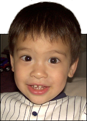
 This is Alpha, the first-born, when he was 2YO.
 This is Beta, the second-born, when he was about 2YO.
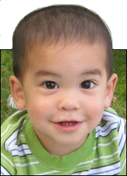 This is Gamma, the third-born, when he was about 18MO.
NFL Logo Update
Oct
6
2021
Since football season has started, I’ve been catching some of the games, and thus I’ve seen the NFL logo a few times.
It’s been the same logo for a couple years now, but the problem with it is just now bothering me.
![]()
If you look at the logo, pay attention to the bottom point, in the middle. See how the “shield” surrounding the NFL acronym is nice and symmetric, with a sharp point right in the middle?
Now see how the NFL letters are fitted in a similar shape as the shield, except the bottom middle point (the lowest part of the ‘F’) is not in the middle.
Why couldn’t they notice that when they were making the logo and do the alignment then?
But since they didn’t, I went ahead and did that for them.
![]()
I think it’s better.
Elam picked up the quiver, With the chariots, infantry, and horsemen; And Kir uncovered the shield.
Isaiah 22:6